Things change. Time moves on and so do people. Businesses and organizations often need to move with these changes, adapting to the evolving needs of customers, patients and employees, even when staying in the same physical location. These three brands show how visually rebranding in their existing space reinforced the goals and direction of their business.
1. Mountain Valley Apartments
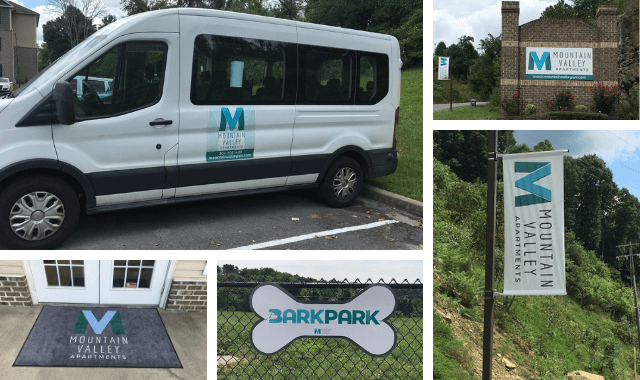
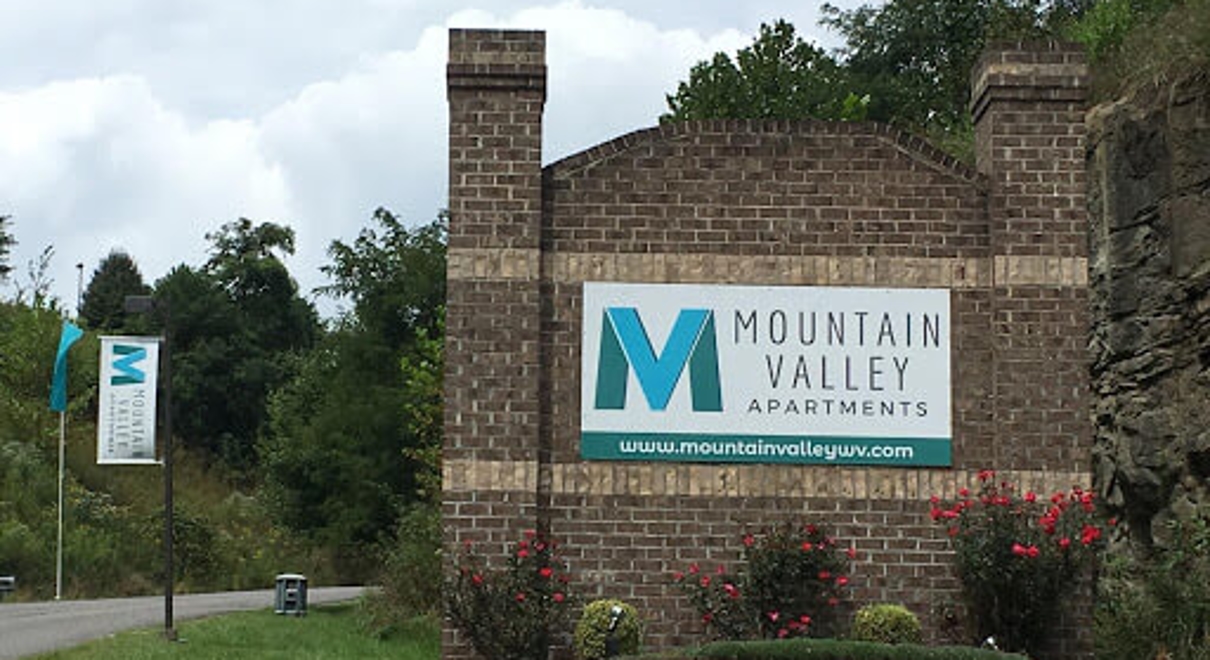
Mountain Valley Apartments underwent an ownership change and needed new branding. With occupancy levels at 67%, the facility was in need of better visibility to attract student residents in a competitive market.
The monument sign was updated, and six flags and seven pole banners were added to the property entrance and driveway area. To better identify the swimming pools, post and panel signs were mounted around the property, along with directional signs and safety rules. Mountain Valley’s two dog parks were designated with custom-designed, bone-shaped signs. Potential residents and guests are greeted with “Future Resident” parking signs and branded welcome mats. Magnetic logo graphics were added to the previous all-white property shuttle bus to help students more easily identify their transportation at pickup. Inside the apartment offices, engraved nameplates identify the new management team.
The updated signs and graphics have improved the apartment complex’s presence, bettering communicating its amenities. Upon completion, the occupancy rate increased to 92%.
2. Bargain Storage
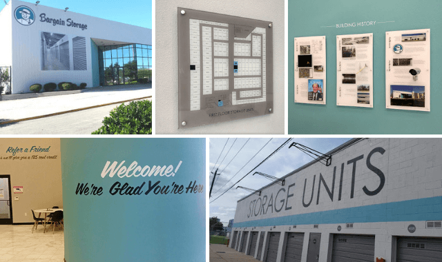
Bargain Storage modernized the branding elements at their corporate office and wanted to implement the same branding updates to all of their existing and future locations. New dimensional letters featuring Buckley, the Bargain Storage mascot, and custom acrylic wall graphics that highlight the history of each building were added. Eye-catching unit numbers and large acrylic wayfinding maps were designed to help direct visitors where they need to go. Additional signs and graphics that were part of the rebrand included exterior graphics, interior brick and wall graphics and safety signage.
Bargain Storage’s updated look and feel is scaled for each location. From cut vinyl to massive dimensional lettering, every detail is consistent with what Bargain Storage wants its customers to know: “We’re glad you’re here.”
3. Innovaire
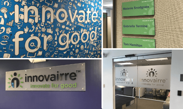
Innovaire, one of the largest nonprofit marketing companies in the country, wanted a branding overhaul to create a new corporate identity and a more positive work environment. Team building and motivational quotes were installed on walls using vinyl graphics and dimensional lettering throughout the facilities’ common areas. An etched glass look was added to the main entrance door, office doors and windows to provide an element of privacy and further extend the new brand identity. Mounted signs with the company logo were hung throughout the building along with banner stands and conference room door decals.
Innovaire’s visual brand identity is now updated and consistent across its facility, promoting and reinforcing their team mentality.