When we have a conversation, we use more than words to communicate. Body language, inflection of voice, eye contact, volume and gestures all play a part in the way we express ourselves to get a message across. This same concept applies with fonts or typeface choices.
Typefaces can project a wide range of emotions through their shape and style, as well as how they are used. Scientists theorize that one’s eye moves along the shape of a line or letterform creating a physical experience similar to how body language is used when communicating. The way your handwriting displays your mood or emotion, so can type. For example, when writing quickly, your italicized text expresses motion. Heavy writing or typefaces are more associated with boldness or anger.
Choosing a font is similar to making a first impression. Be thoughtful about what you want to convey to your reader. Typeface influences the audience perception.
Author and Graphic Designer Sarah Hyndman explains, “Scientists have discovered that our brains can mistake the ease of the reading process for the ease of the subject we’re reading about. For example, psychologists at the University of Michigan found that college students thought an exercise routine would be easier and that they would be more likely to incorporate it into their daily routine when they were shown instructions in a highly legible typeface.” Hyndman also shares that high school students in Ohio received higher marks when they read text in an unfamiliar font (according to neuropsychologist Dr. David Lewis). This unfamiliar font slowed their reading, which improved comprehension vs. reading the words quickly.
When considering fonts, focus on who’s reading your work and who you want to resonate with. Want your brand to be perceived as friendly and childlike? A typeface with curves and personality may be best. Want to be perceived as modern and professional? A classic, clean typeface would be more appropriate.
Placement and final layout of your typeface is crucial. The following examples are either funny or frightening depending on your outlook:
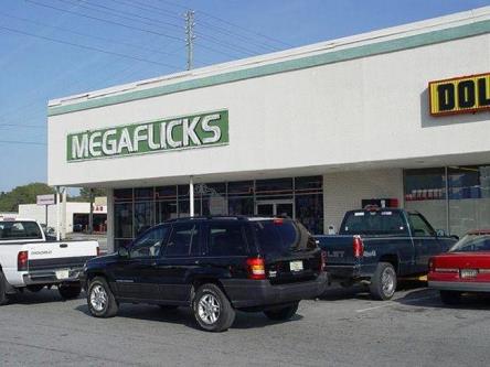
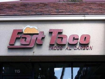
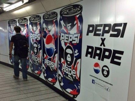
Choosing a typeface for your signage is an important element of your branding and visual communications strategy. These examples of everyday signs have been changed with different fonts. Now, they are more difficult to read at-a-glance, hindering their effectiveness.
What style of font or typeface does your organization use? Is it consistent with your brand image? Something so seemingly small as a choice in font can make a big visual impact. Keep these tips in mind when putting your brand’s visual communications strategy together.
To learn more information on fonts and brand visual elements:
Colors, Fonts and Design... Oh My!
References:
https://www.itsnicethat.com/articles/why-fonts-matter-sarah-hyndman-260116
https://speckyboy.com/fonts-matter-brand/
https://www.nucleo.com.au/typography-not-for-the-font-hearted/