Today’s blog is all about PMS – Pantone Matching System (NOT the PMS you’re thinking of). The PMS I’m referring to is vital to color and design. Color is very subjective; not everyone sees the same colors the same way. That is where the Pantone Matching System comes in.
What is the Pantone Color Matching System?
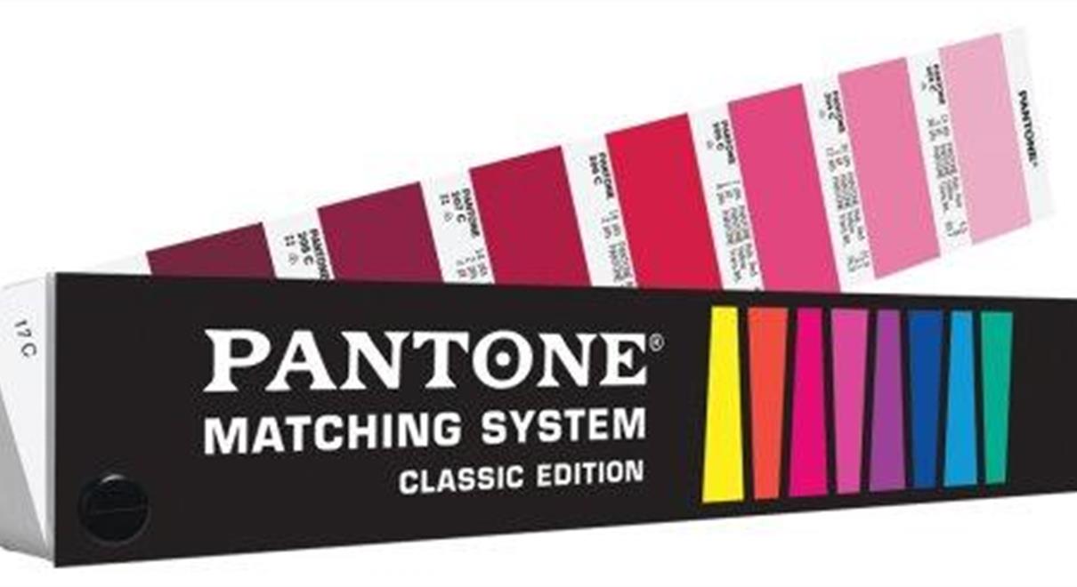
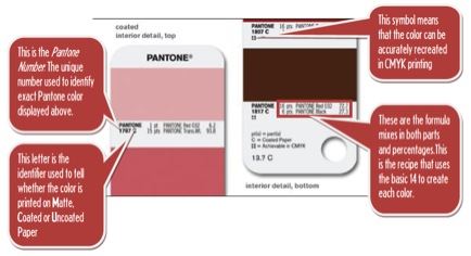
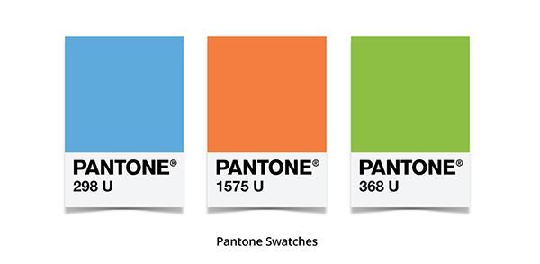
Since its creation in 1963, the Pantone Matching System has become the industry standard for designers, agencies and printing companies alike. The Pantone Color Matching System is a standardized color matching system, utilizing the PMS numbering system for identifying specific colors. Standardizing the colors helps ensure different manufacturers in different locations can reference a PMS-numbered color and match it. The most commonly referenced colors are in the Pantone solids palette. The Pantone solids palette consists of 1,114 colors, identified by three or four-digit numbers, followed by a C, U, or M suffix to denote what the color will be printed on. For example, Pantone 199 Red can be identified as Pantone 199C (C= Coated Paper), Pantone 199U (U= Uncoated Paper) or Pantone 199M (M=Matte Paper).
Originally designed for the graphics industry, the pantone solids palette is now used by a wide range of industries, and is the most commonly used palette. The range of 1,114 Pantone colors are created by mixing the 14 Pantone basic colors in different quantities or formulas. Each one of these colors is given an identification code that helps create a universal standard for that color.
Why the Pantone Matching System Matters
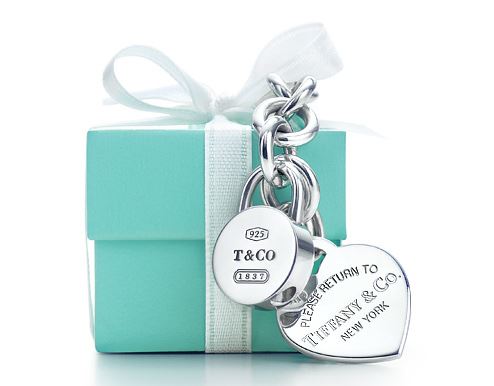
Color is critical in design. Some brands have a specific, signature color or colors that must match regardless of where it is displayed, from their website and business cards to billboards and trade show displays. For example, Tiffany & Co. worked with Pantone to create their signature shade of light blue (Tiffany Blue: PMS number 1837, the year the company was founded). Then, they trademarked the color. Most people are familiar with Tiffany's blue boxes. When someone receives a Tiffany box, they know just by the color that something special is inside.
The Pantone Color of the Year
Beginning in 2000, the Pantone Color Institute declares an annual “Color of the Year.” Representatives from various nations’ color standards groups meet in private to present and debate. Then, they choose a color for the following year. For example, the color chosen for 2017 was determined in 2016. The color chosen is done so in part based on how the group feels it connects with the current times.
In 2013, when declaring Radiant Orchid as the 2014 color of the year, Pantone explained in a press release: “Radiant Orchid reaches across the color wheel to intrigue the eye and spark the imagination. An invitation to innovation, Radiant Orchid encourages expanded creativity and originality, which is increasingly valued in today’s society.”
When Pantone announces its Color of the Year, industries pay attention. The color trend may not be adopted right away but Pantone influences fashion, makeup, automobiles and more. In 2013, Pantone’s Color of the Year was Emerald. This didn’t attract much public attention until Michelle Obama wore a beautiful emerald green dress to the Kennedy Center Honors Ceremony almost a year later. Two days after that the mention of the color spiked on social media. It became so popular, she wore the hue again a month later to President Obama’s 2014 State of the Union Address.
2016 entertained two Colors of the Year: Rose Quartz and Serenity. Rose Quartz was very popular at Fashion Week that year. There was a rise in gender-neutral dressing rooms and Rose Quartz aligned well. One has to wonder if Pantone’s Color choices are self-fulfilling prophecies or is Pantone just really good at guessing what people want? Either way, they certainly are successful at driving the market and have established themselves as a global standardized color system.
For 2017, the color of the year is Greenery, considered a nod to the “go green” movement. Be on the lookout for where this color may turn up this year and remember the system in place to ensure just the right color is shown. From the building signs where you work to the new pair of shoes you bought, the Pantone Matching System is an important tool that helps color our world.