There’s no denying that consistent visual elements are the foundation of an immersive environment. Just look at Disney World to see a perfect example of how small details and consistent branding can add up to a magical experience. The more visual ambiance a property has, the more guests feel transported to a special environment. Wayfinding signs (including everything from guide signage, place identification, visual landmarks and room numbers) play an essential role in creating this cohesive feeling. Resorts and vacation destinations can deliver a 5-star wayfinding experience with the environmental design principles below.
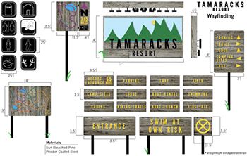
Photo Credit: Josh Cornell
Branding from Start to Finish
Professional wayfinding designers understand the importance and power of having a totally consistent look and feel for all signage. Take a look at this example of a ski resort wayfinding system from designer Josh Cornell. It illustrates how a visual theme (in this case, a rustic-but-streamlined look with powder-coated metal on weathered wood) can carry across everything from the entrance sign to the garbage cans.
If a resort features well-designed branded graphics your team can build a powerful emotional connection between visitors and the destination. And the more visual ambiance a resort has, the more upscale it feels to guests. People are more willing to pay a premium for an experience that feels transporting over one that feels sterile or thrown-together.
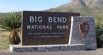
Photo Credit: Ralf Kiepert
Use Native Materials
A simple but impactful way to give a resort a sense of place is to use native materials in the signage. Think volcanic rock for the monument sign at a Hawaiian all-inclusive or antiqued copper room numbers in a Rocky Mountain hotel. Even if the material doesn’t technically come from the surrounding area, using indigenous symbols or naming rooms after local landmarks can help give signage a very specific sense of place.
The National Park Service is a great example of how a national organization can use diverse native materials across the country and maintain cohesive branding. When the parks system developed a UniGuide standard for all signs many park managers were concerned the unique character of individual parks would be lost. A perfect compromise was reached where the actual park sign featured the custom “Rawlinson” font and the NPS arrowhead logo, but the sign’s support structure could be made with any native material that represented the park.
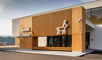
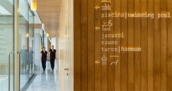
Photo Credit: R2 Designs
Using Symbols for International Locations
Wayfinding designers have two main objectives: communicating important information clearly and making it look terrific. Finding the balance between clarity and aesthetics can be one of the biggest challenges to the success of a project. Many global resorts and hotel groups have to not only communicate clearly in one language, but provide direction to guests from all over the world. Putting the same information on one sign in five languages can look cluttered and break the spell of seamless wayfinding.
A common solution to this issue is the use of symbols to communicate across language barriers. Design group R2 created an excellent example of symbol use done right when they tackled a new look for Hotel Minho in northern Portugal. They chose the symbol of the region, a stag, as the main graphic and then devised a series of informational pictograms based on the typeface Capibara and inspired by the letters of Theo van Doesburg. These pictograms were used throughout the property to direct and inform international guests while creating a modern and playful feel.
Wayfinding signage at its most basic moves people through an environment to a desired location. But it can be elevated to an art and science that creates a seamless experience and effortlessly communicates a sense of place. Hospitality managers can take their properties to the next level by incorporating these immersive visual communications principles.
Related Articles:
Wayfinding in Amusement Parks: Navigating Your Customer’s Thrill
Solve Your Wayfinding Challenges
Navigation Tools Throughout History
Resources:
https://www.behance.net/gallery/5147941/Ski-Resort-Way-Finding-System
http://graphicambient.com/2014/06/19/hotel-minho-portugal/
https://www.behance.net/gallery/5147941/Ski-Resort-Way-Finding-System
http://r2design.pt/index2.php?id=198
http://r2design.pt/
https://segd.org/national-park-service-identity-and-signage