Type fonts are like other people’s jeans- we only notice the best and the worst, the coolest or the most outdated. Font design is a significant part of visual communications and bad font choices can lead to bad branding. Using the wrong font can clash with the message and confuse the reader. Check out these examples of when good messages get hijacked by bad fonts…
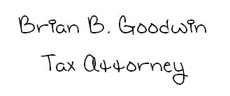
1. The only way you’re a tax attorney with this font is if you’re a tax attorney for the Peanuts gang.
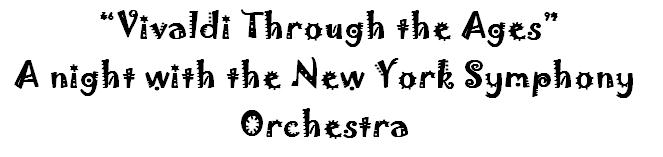
2. With special guest Weird Al Yankovic. When used outside of a playful context, whimsical fonts like this convey an image of immaturity.
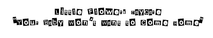
3. Unfortunately children's arts and crafts aren't the first thing this font evokes. It is important to understand the cultural context of your font and avoid any negative associations.

4. Maybe avoid the hot stone treatment. When creating a relaxing and inviting brand experience, keep in mind that bold and aggressive fonts and colors can be a major deterrent. Make your font relaxing and calming, not abrasive.
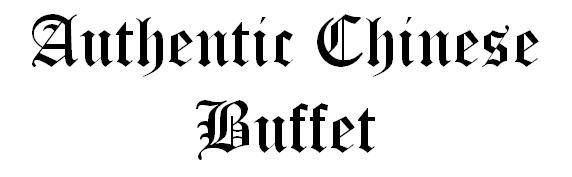
5. Fonts need to match their message; Old English and Chinese food do not mix. Savvy customers often associate imagery and messaging with other related instances. Avoid being the brand that "stands out" for the sake of being different; let your product and additional messaging do the work for you.
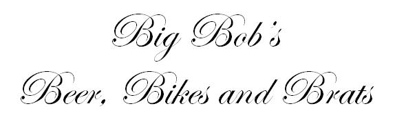
6. Read it twice, this isn't an invite to a wedding reception. Think like a customer. Would you want to visit Big Bob's on your motorcycle?
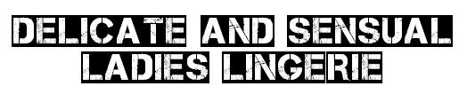
7. Giddyup evokes many emotions, usually around punk and metal, but never delicate nor feminine. If your product is light and airy, your brand messaging should be too.
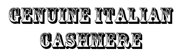
8. This brings up a new meaning to "Spaghetti Western". Some fonts conjure up a certain time period or place, and are best used when referencing something fitting to that time period or place.
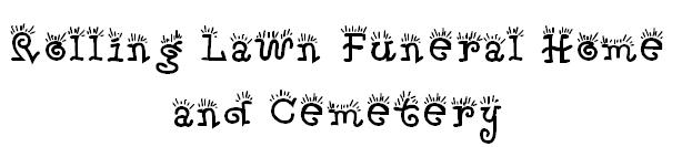
9. Reconsider playfulness in every situation. In more instances than not, looking professional when dealing with sensitive topics is ideal.
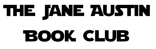
10. Meetings are held in a galaxy far, far away. Knowing the purpose for your business or group can have a huge impact on your messaging and use the font. Saving futuristic fonts for Sci-Fi clubs and conventions is a good rule of thumb.
Have you seen any examples of the wrong font leading to bad branding? Let us know @FASTSIGNS!