Even if we don’t know it, most of us are familiar with point of purchase marketing. It’s the many strategies that businesses use to get consumers to find some extra space in their shopping carts for one, or three, more items.
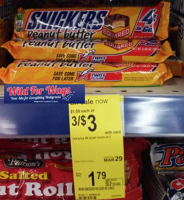
We’ve all been there: “Three candy bars for three dollars?! It would be financially irresponsible to pass on that deal.”
The signage above is a traditional approach to point of purchase sales. Its biggest value is in its low price and the impulsive nature of chocolate. Of course, Snickers is a well-established brand that needs only the power of a low price to fly off the shelf. For less-established brands, their point of purchase strategy needs to be bolder, more sophisticated, or a combination of both. Here are a few examples of retail brands that are using innovative signage, both traditional and modern, to bring attention to their products.
Traditional POP Signage
When we hear the word “traditional”, we sometimes associate that with being outdated or old-fashioned. But that doesn’t have to be the case. Many brands are using traditional signage in new, creative ways that put a fresh twist on the displays we’ve seen for years in retail stores.
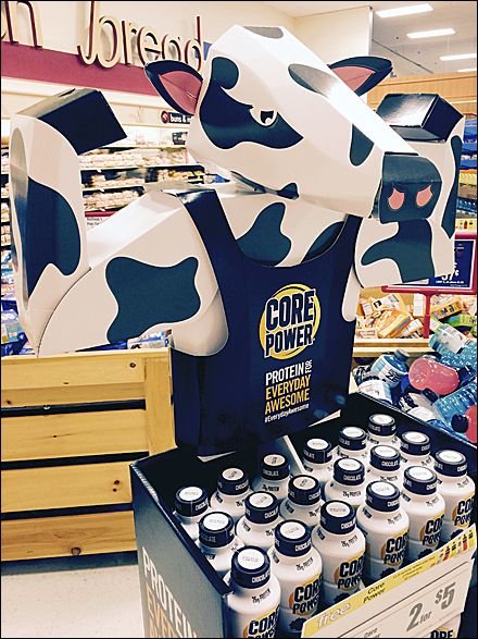
This milk shake company could have easily relied on its display to sell products based solely on its price. As you can see, two bottles of the drink could be had for five dollars. But they decided to go further, using a protein-packing cow cutout that attracts eyeballs, informs potential customers and builds brand awareness. If you don’t buy their product this time, you might the next.
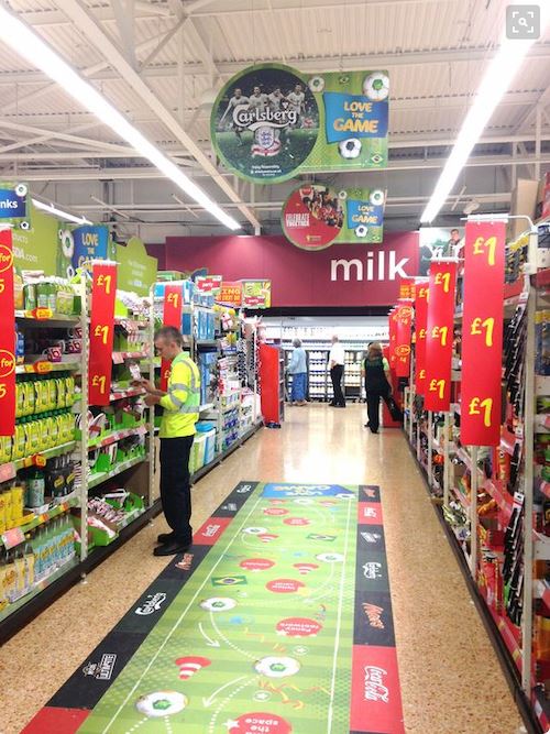
We’re familiar with brands fighting for the valuable eye-level shelf position. But maybe that space is getting a little crowded? Some brands are looking for other opportunities to catch the consumer eye, and many are using the little-used space on the floor. After years of marching through the same shopping setting, consumers can become numb to the environment. Floor graphics have a way of reintroducing these familiar spaces and making them new again. These can be especially valuable for products geared toward children, who have a different idea of “eye-level.”
Modern POP Signage
Depending on your brand, more modern forms of point-of-purchase signage could be the way to go. More and more, that means incorporating interactive digital signs into your point of purchase displays. Here are a few brands that are reimagining what point of purchase signage truly is.
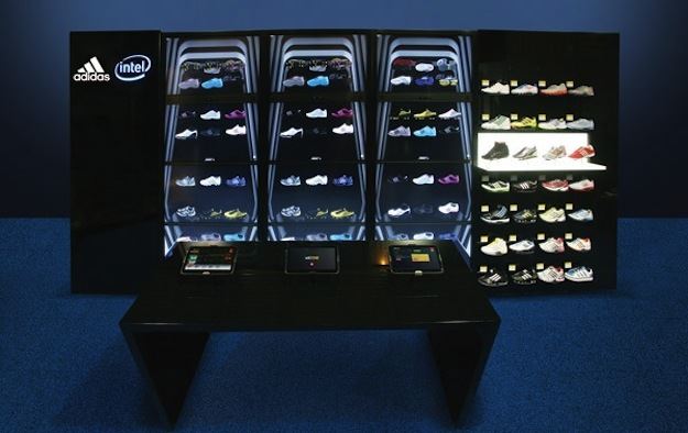
In a highly competitive and lucrative industry such as athletic apparel, a slick and innovative presentation is as important as the products themselves. Through digital wall displays, this shoe brand is changing the way customers shop for shoes in their stores. Customers are free to grab the shoes on the backlit walls, but in addition to those shoes, thousands of variations and styles are also available on interactive screens to the side and in front of the display. If the customer can’t find what they’re looking for with this point of purchase display, they must really prefer the swoosh.
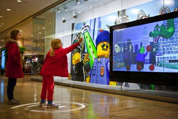
Digital displays are even extending the boundaries of point of purchase in retail stores. Point of purchase is no longer confined to the checkout aisle. Many retail stores are using the space outside their doors to let potential customers interact with their brand. Outside this toy store is a strategically placed digital screen that allows passersby to play a free, interactive game. This allows users to enter the world of the brand, and hopefully, enter the store as well.
In the end, traditional POP signage and modern POP signage are far more alike than they are different. Where they differ in technology, they align in creativity and execution. Any and all of these forms of signage should be a welcome addition to a brand’s marketing materials. Wondering how to get the most out of your point of purchase signs? We’d love to help. Call 800-FASTSIGNS to consult with our professional designers.
Related Articles
Examples of How 3 Companies Use Signs and Visual Graphics to Sell More